Plein Air Painting Tips
Why Plein air?
Well for one, It gets us out of the studio and into the fresh air; and photographs just don’t cut it. Working from photos is not bad, but they have drawbacks: they’re too blue, the shadows are black (no colour or detail) and everything is in focus. They can be a very helpful reference in the studio, but there is no substitution for being present in nature. When I get out in nature and look around with an artists eye, I feel my lungs expanding, my heart opening and my soul soaring. For me, communing with nature is an enlightening and inspiring experience. To find Plein air painting enjoyable, it helps if we leave our egos at home because, at first, plein air painting can be a very humbling experience. Achieving a frame-worthy painting is unlikely and not necessarily even desirable.
The Great Outdoors
In heading outdoors consider the weather and the terrain. Wear a hat or visor and use an umbrella or set up in the shade to protect your eyes from the glare of the paper. Please note that sunglasses can affect the colour balance of your painting. Don’t use coloured tape to hold your paper in place. Wear appropriate footwear and layer your clothing, bring insect repellent, sunscreen and drinking water. Bring a foldable chair to relax in, even if you paint standing. Bring bear spray for your protection. Bring a garbage bag to protect your equipment and painting in a rainstorm. Please respect the location, remember that we are visitors and should leave nothing behind but footprints. Our rags, painting water and garbage should come home with us.
At the site, What attracts your attention or what tickles your fancy. What do you like? What do you feel an affinity for? What do you want to include? What excites you? Why do you like it? If you understand what it is about the scene that moves you, then you can decide on a palette, the techniques and the composition that will help you enhance it.
Find your location, before you set up, scour the immediate area around you for ants, (are you about to set up on an anthill), spiders, snakes (crevices or dens), animal skat, bears (berry patches, orchards). Which direction is the sun tracking, the wind blowing.
Deciding on the image, It is quite ok to take a piece of the landscape using a viewfinder and paint exactly what is inside the area. The cropping itself involves making design decisions. It’s also ok to rearrange the furniture. In order to figure out how to do this I highly recommend that you do a few quick thumbnail sketches and value sketches. Watercolour painting is much easier if you have a plan. They don’t have to be big or elaborate. They can be done in a few minutes and they will save you from a lot of frustration.
Composition and Design
From my observations, the most difficult part artists have in plein air and the shortfalls in their paintings are mainly related to composition and design. A well designed image will have merit even if it’s poorly painted, but a poorly designed image remains a poorly designed image no matter how well it’s painted. There are so many considerations and guides to composition that the subject can be overwhelming.
Keep a few ideas in mind like: avoiding bullseyes, the ping pong effect, kissing edges, pointers and routes out of the image, people should face inwards, cars and boats should be entering the image not leaving, trees and objects near the picture edge should lean in, use zig zags or “s” curves to lead into the image, lead the eye with lines, dashes and edges, avoid things coming directly from the corner, avoid duplicating items of the same size and shape, Include some resting areas for the eyes, odd numbers of things work better, geometric shapes look unnatural in a landscape even if they occur naturally, leave a little intrigue, allow the viewer to imagine what’s just around the corner, try vignetting the image. A simple method of dealing with some of these is by using the rule of thirds.
Using the Rule of Thirds
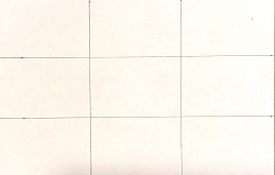
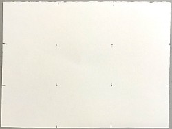
A simple composition guide is the rule of thirds to position points of interest, counterpoints and locating the eye line or horizon line. I also use it as a grid for scaling up a thumbnail sketch. By making your thumbnail sketch in proportion to your paper size, a grid of thirds drawn on the thumbnail can be inferred on the watercolour paper by marking thirds on the edges and four dots where they would intersect. Lines drawn on the watercolour paper are difficult to erase and usually show through the painting.
Eye level or horizon line is the height your eyes are above the ground when the picture frame is vertical. You look up at everything above your eye line and down on everything below. Perspective lines merge on the eye line
Perspective, every thing I know about perspective: the further away objects are, the smaller they appear. This applies to everything, trees, fence posts, clouds and waves.
Focal point, your eye is drawn to areas of detail, contrasting value and saturated colour.
Value sketch, because the light will be constantly changing it is difficult to do more than a basic value sketch. Keep an eye on the changing light and try to capture moments that are interesting. Squint to see the values better.
Colour, warm colours advance, cool colours recede. On my landscape palettes, I place french ultramarine and burnt sienna side by side (a versatile mix). I add yellow ochre and cobalt violet to my palette and I set up a separate area for mixing greens.
Atmospheric veil or aerial perspective, objects become less clear as they get further away, they become lighter in value and take on an increasing blue hue.
Keep those brushes wet,
Ray Syrja


